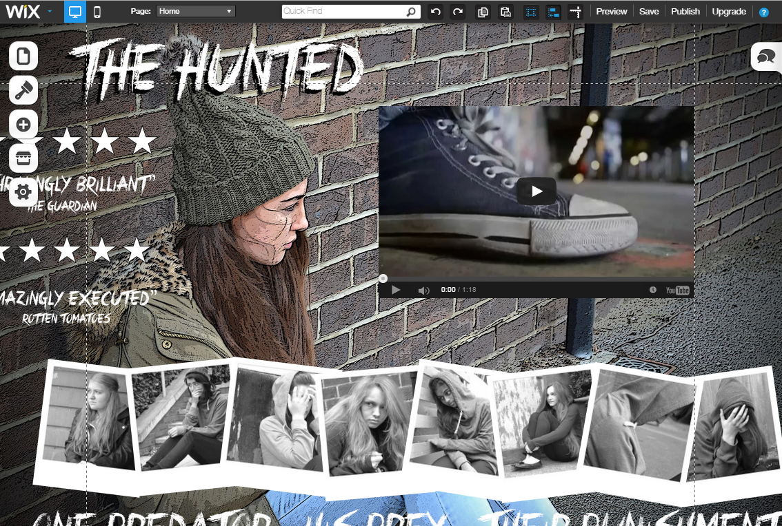
.png) While thinking of different designs for our website, I felt like our protagonist Emily, needed to be a part of it somehow. When doing the photoshoot for the poster, we took a variety of shots as at the time we were unsure of what we were going to do. There was a mid shot of Emily sitting by a wall looking into the distance which we did not use for the poster, it was also landscape which made it a better fit for the website. For the first draft, we used the original picture but then I realised it didn't stand out and wasn't as effective as we planned.
While thinking of different designs for our website, I felt like our protagonist Emily, needed to be a part of it somehow. When doing the photoshoot for the poster, we took a variety of shots as at the time we were unsure of what we were going to do. There was a mid shot of Emily sitting by a wall looking into the distance which we did not use for the poster, it was also landscape which made it a better fit for the website. For the first draft, we used the original picture but then I realised it didn't stand out and wasn't as effective as we planned.
I then imported the image onto Photoshop and began playing around with various effects to try and find one which could work for our website. I found one called "poster lines" which gave it a hand-drawn quality, which again could work with our use of handwriting for our credits and the font we used for the typography on our poster. I then also added a vignette quality to the border, which made it seem more darker and more like a website homepage.
 After importing it onto the Wix website the main problem that I had with the image I chose was the fact that it changed depending on the size of the computer screen I was working on, as my laptop is obviously a different size to the macs we use in school, so it was hard to move the other images around it.
One of the main requirements for our website is that it has to use the same typography as included in the trailer and on the website. However, there was an issue as Wix did not have the specific font we used as one of their default settings, nor would it let you download a font onto the website itself. Luckily Megan had already had to save the title as an image on Photoshop with a transparent background. I then imported the image onto the website editor and readjusted the image so it fit into the corner.
Another major thing to be involved is that our teaser trailer video needed to be present on the home screen and it needed to start playing as soon as the website was loaded. I decided to place the video to the right of Emily's face as I didn't want to cover up any part of her body. By doing this, it made it look like she was looking in the direction of the video which worked out to our advantage.
I wanted the Polaroids to be a main feature of the website as they are with the trailer and the poster but it was complicated to fit them alongside her body and the trailer so I opted to spread them out across the bottom of the screen. I then added the same effect that Megan added on the first website, where the mouse rolls over the Polaroids it flashes slightly.
However, when I finished making this draft, I felt like it wasn't as effective as our final version, which linked a lot better to the poster, including the background and using the Polaroids as links to the other pages. Although I like the idea of using our antagonist as the background, I feel the image isn't reflective of our psychological thriller genre, whereas the brick background used on the poster has a fade-to-black border around the edge, making it darker. Similarly, if I didn't want to cover up the image of our victim, it meant the video, links, tagline, reviews and Polaroids would either have to be a lot smaller or just look really cramped which isn't the aesthetic we were going for, so it was a lot easier to use the brick background.


No comments:
Post a Comment