Showing posts with label Hayley. Show all posts

Friday, 24 April 2015

Evaluation Question 1:

In what ways does your media product use, develop or challenge forms and conventions of real media products?

Teaser Trailer.

(mid shot of our victim)
(POV shot of our killer)
Firstly, the purpose of a teaser trailer is to get the audience interested in the film within a short amount of time (usually around 1 minute) so they will only show a minimum amount of footage just to briefly outline the plot and genre but not give too much of the film away. The majority of our trailer is shots that introduce the audience to the main characters, until the build up towards the end, where we see quick paced flashback shots of the previous 8 victims being caught. The two main characters shown are the villain and victim of our film (the serial killer obsessed with homeless teenagers and his 9th victim, who is different to the others but the audience might not be sure why at this point as it's only a teaser trailer).

In order to follow the conventions of a typical teaser trailer, we completed deconstructions on existing trailers that we thought were successful in their job to intrigue and excite the audience. I also completed a deconstruction of the trailer and some research from watching the film 'Nightcrawler' as I felt it had several connections to our own film package.


We followed the structure of most teaser trailers well, including the important features such as a green screen, production company and numerous credits as well as the title of the film being placed at the end. The trailer starts off with the 'green rating screen' and we decided to rate ours as a 'restricted' film (as our production company are American), although in the UK it could be considered a 15. This is because even with it being a psychological thriller, it would still contain horror elements such as details of the murders and hopefully the audience would be frightened by the idea that a serial killer can look so ordinary and live so near by (our intention was to portray him that way). We then included a clip of the Paramount Pictures opening credit but shortened it from 20 to a few seconds to fit in with the pace of a teaser trailer and also put an effect over the top in Final Cut Pro so it wasn't too bright for a psychological thriller.
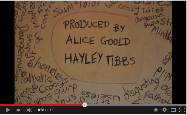
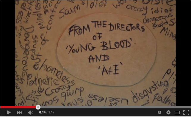

For our credits, we developed the idea of stop-motion effect writing to resemble the killer writing in his book and so Megan took individual pictures while writing out the credits and we edited them together on Final Cut. This developed the conventions of the credits typically used in psychological thrillers. However teaser trailers don't usually contain that many credits as they can take up too much of an already restricted time limit so I feel we challenged that convention slightly, by having a longer trailer and therefore more space to include credits. 
The first credit was "From the directors of 'Young Blood' and 'A+E'" and these types of credits are often used to highlight what previous films it will be similar to and therefore the audience can make a quick judgement as to whether they think they would enjoy it or not. Similarly we then used "Produced by Alice Goold, Hayley Tibbs" and "Directed by Megan Tee" for the same reason and to highlight who created the film. 
We then used our tagline "One Predator, His Prey, Their Punishment" as this often highlights the plot of the film and it is important to include it in a teaser trailer and because this was a longer credit we placed it right before the pace of the shots began to speed up towards the climax of the trailer before our final credit which was the title of the film.


In terms of sound, teaser trailers often use voice-overs from the film to play over the quick paced shots as there isn't enough time to show huge sections of dialogue. In our trailer, the beginning is a low humming noise and we placed a voice over on the top in the format of a news report to highlight the context of the film... "so far there has been a total of 8 deaths in the past 8 years". The music in teaser trailers will usually build up to the climax at the end and we followed this convention in ours. We used various background tracks and edited particular sections to help it build up. This was aided by the use of a 'cinematic boom' sound effect which was paired with the quick-paced flashback shots, a whirring metallic sound every time a credit was shown and also a high pitched eerie noise at the end.

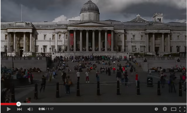
The editing through our trailer followed the conventions of a typical thriller trailer, it started off with slower paced shots (such as the time lapses and shots of London) and then built up speed with shorter shots being used to increase tension (such as the flashback shots right at the end). These flashbacks shots were filmed using a wide variety of camera angles and in order to resemble this trait, we had to organise another filming date with our previous victims as the footage already in the trailer wasn't intriguing and exciting enough.

We challenged the conventions of locations in psychological thrillers, as by setting it in London and therefore using well known tourist attractions, the locations we chose resembled those used in urban drama films. However, as the majority of our trailer is showing our victims original equilibrium (Todorov's Narrative Theory of Equilibrium) and how our villain is going to disrupt that, most of the filming locations are going to be in urban areas.

Poster.
The conventions of a  film poster are

  • Making the genre easily identified
  • A small glimpse of the narrative
  • Including the main characters of the film 
  • A date or time of the films release
  • Information of the production company and directors at the bottom
  • Reviews of the films from respected publications.
  • The title of the film clearly shown
  • A tag line linking to the question

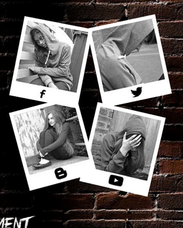
We have conformed to most of these conventions, we include the main character and she is seen to be different as her Polaroid is larger than the others and the fact that she is in colour and the other girls are in black and white. 

We also looked at the conventions of psychological thriller posters and did some deconstructions we found that  they often included a large face in that is prominent in the poster. For example this is seen in Lucy, shutter island and Black Swan.


Also the genre is quite clear as we have used predominately dark colours especially towards the edges which eludes to the darkness in the narrative. The hands around the face of the protagonist also reveals the narrative to the audience this is also reinforced with the title and tag line. The polaroids of the girls are also quite an important aspect of the narrative. We also researched this and looked at the possible ways in which we could use the polaroids. We were inspired by Momento which is another psychological thriller which uses polaroids in its posters.

Although we do subvert the convention of including the psychologically disturbed individual, we did this as we wanted to keep the hunter quite mysterious and focus on the vulnerability of the protagonist. We also subvert the golden rule which has the area that your eye is immediately drawn to at the top of the triangle. 

We also conform to showing the important information such as the production company and all the people involved in the film such as the casting director and actors. We also included a hashtag which is also linked to our website.

Website

When we first thought about creating our website we looked into other professional film websites to see what some of the typical conventions and features that were included that we could therefore include in our own. We also looked at previous A2 websites to see what layouts worked best and what generally was good and bad about them.

We found that for our website we must ensure that it is:
  • suitable for our target audience
  • had our teaser trailer embedded and starts playing automatically
  • clear title of the film
  • suitable colour scheme and text colours
  • social network links
  • user friendly, not complicated
  • critics reviews
  • production companies
  • age rating


Planning.
For our website we started off by drawing up some initial ideas to what our website could look like. With this we also ensured that we had all of the conventions and elements of a website included in our own and also our deconstructions of previous films (Akeldama, Final Destination, Dead Footage) we were able to see what elements were effective on a website and other that did not work so well.


Development.
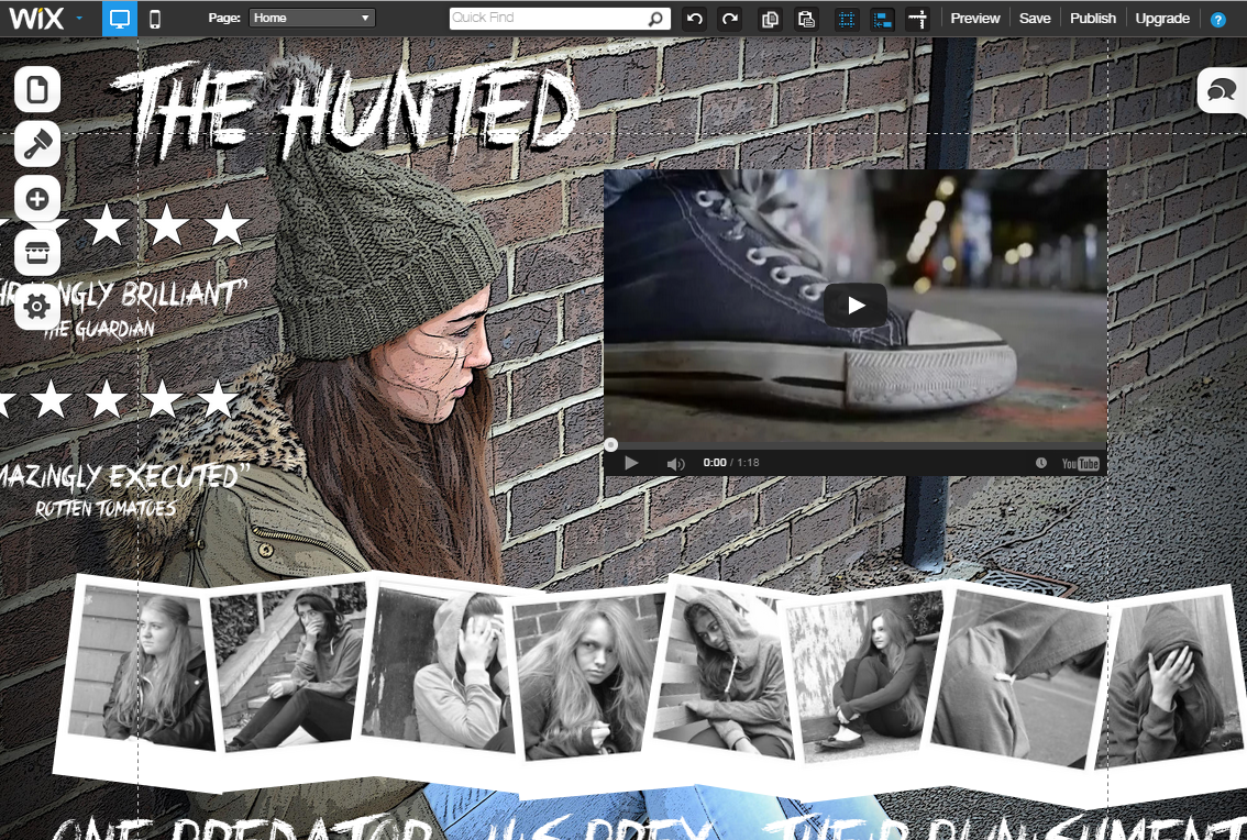
We developed our website by using a background that is appropriate for our genre and ties into our narrative. We have included the Polaroid pictures which can be seen a constant throughout our trailer which involves our protagonist's past victims. However, our protagonist's potentially next victim is not displayed on our website this was intention to allow for our teaser trailer's conventions of having a restricted narrative so that our narrative could be enigmatic and entice our audience further. We also included our teaser trailer embedded into our website which is another convention of a website for a theatrical film and also to allow the teaser trailer to play automatically when the website loaded.

We also had to include social media links which were active onto our website's design. The defualt for these links (Facebook, Twitter, Youtube, Blogger) were very different to the atmosphere of the rest of the website and also to our trailer. Instead of adding these default links to our website we decided to put them onto the bottom of the Polaroid pictures and created these as 'photo buttons' so that they could lead to a link. This allowed for our website to be user friendly as the links are clearly displayed to our audience and it also stays within our colour scheme and genre conventions.

Our buttons which connected to our other pages and social networking links allowed us to develop on the typical conventions of websites, as these are essential to the website's design. We have manipulated them to allow for our constant use of the Polaroid pictures to still continue and so that it keep in line with our other products and genre.

Wednesday, 22 April 2015

Evaluation Question 2:

How effective is the combination of your main product and ancillary texts?

Final Trailer:


 Final Poster:


 Final Website:


Typography:  


(website)
(poster)


After creating the credits for our teaser trailer by hand to get the stop motion effect, we realised we wouldn't be able to do the same for our poster and our website. We chose to look at various handwriting fonts on Photoshop that we would be able to use instead and came across "Crimes Times Six" which we liked as it looked scribbled and messy which worked with our character and the shot of him writing in the trailer. This was simple enough for the poster however when it came to including it on our website we were unable to use the specific font. Thankfully Megan managed to save it without a background and so we were able to import the title onto the website as an image as she explained in this blog post.


Polaroids: 


(trailer)
One of the main features of our promotional package is the use of Polaroids during the trailer and also on the poster and website. In the trailer, the physical Polaroids have been positioned in the killers book with him stroking the pictures. They are also flashed up at the end in chronological order as the tension builds up.


(poster) 
We knew we wanted the Polaroids to be the focus of our poster after deconstructing 'Memento' posters and so drafted numerous versions where they were scattered across the poster. Finally we decided to use a different image of our victim Emily, and so we organised a photoshoot where we preferred the shot of her with the gloves covering her mouth. We then had to import that onto Photoshop to edit out the background and change the format of it. Similarly for the poster, I went on a website  and edited all the images so they were black and white and had the Polaroid border around the edge before adding them to the poster.


(website)
(website) 

For the website,  we decided to use the Polaroids as links to social media and the other pages of the website. Megan succeeded in editing the Polaroids so that when the mouse rolls over the image it flashes.
On one side of the trailer are the links to 'home', 'cast', 'gallery' and 'cast' whereas the other side is links to social media, however when we used wording it didn't look as effective as the original logos although they needed to be edited to make it darker.


Colour Scheme:


(release date on poster)
Due to the killer's book being a significant aspect to highlight his psychological issues and his obsession with the homeless teenagers, we had to make sure the book we chose was suitable. The pages were a brown, coffee colour and we wanted this to be featured when choosing the colour of some of the typography on our poster.
(scribbly handwriting in book)
Similarly the colour scheme of our products is predominantly dark, dull colours such as black, white and brown, including typography, choosing to have the Polaroids black and white and the brick background, which we had to edit to make it more darker. However, when looking at the Polaroid for the 9th victim, we decided to have that in colour to show to the audience that she is still alive and along with this we edited the graffiti background (where he finds her in the trailer) behind her to make it stand out against the others even more.


Images:
(background used for poster and website)

In our final versions of the poster and website, we chose a brick background to add to the urban
(one of the few shots of our killer)
element of living on the streets but in a draft of the website we had the option of using an edited picture of our victim, however we decided against this as it wouldn't fit in with the poster. Even so, our victim is still heavily featured in the trailer and the poster whereas the killer is only included in the trailer, as we didn't want to reveal too much about him in the promotional package. Similarly we used the Polaroids to express the psychological, obsessive side of our killer and so to highlight the genre, we felt these needed to be featured in all three media products. However we didn't include the dates of their deaths (as seen in the trailer) choosing instead to have the tagline as the captions on the poster and to use the picture itself as links to other pages for our website.


Overall I feel the combination of our trailer, poster and website is effective in its purpose of promoting the film. It should be clear the audience that our film is a psychological thriller with a focus on serial killers and obsession.


Wednesday, 11 March 2015

Re-shooting:

After completing our first draft for our trailer, it was pointed out to us that if we included a more wider variety of shots, it would be more "trailer-like" as most trailers generally include shots from throughout the film, especially as we are creating a teaser trailer. However as we are not filming the whole film, we had to set up specific shots that would only be shown on the screen for our a couple of seconds but would add diversity to the type of shots we included.

We decided to use the girls that we photographed for the Polaroids, this made sense as they would have a role in the film and so are already featured in the trailer anyway. As we were focusing on the girls themselves, this meant we didn't need to look for a specific location to use as a background so we filmed all of the shots in school, saving us time.

We also realised that an average mid shot of our killer sitting down in his living room, didn't add anything to the mise en scene of our trailer and stood out as a bit bland so we changed the shot completely and just did a close up of his knees as he sits down.

A collection of the shots we used in the final version of the trailer are below, including more close ups, a point of view and a shot where the camera was on the floor.


Monday, 9 March 2015

Evaluation: Final Trailer

I decided to complete an evaluation of our final trailer, after all the changes we have made to see whether we have improved since Megan did an evaluation of our first draft here.


Above is our final trailer, I feel the amended trailer is significantly better than our original first draft (as expected).

Firstly, the music dipped in our first draft, so it built up far too early, stalled for a few shots and then restarted and this wasn't working. The sound in our final trailer is definitely more effective, as it builds up more gradually until it culminates at the final moment after the Polaroids flash up. However we did have a slight issue with the final sound used, as when editing the sound effect we wanted was a high pitched ringing noise but unfortunately, when uploaded to YouTube the sound is affected slightly and so the audience won't feel the full impact.

Another part which was successful is our time lapses, when planning the locations that we could film in, we weren't sure how they were going to turn out but thankfully we managed to capture the shadow going over the National Gallery in Trafalgar Square which is a shot I think our group should be particularly proud of. Additionally the other shots taken inject a hint of pace into the opening shots of our trailer, which are slower in order to set the scene.

Our credits were also a risk we decided to take, as the idea we had could have worked or gone completely wrong but luckily it went well and is quite effective as it fits with our genre. However in our first draft, we included far too many, considering we are creating a teaser trailer rather than a theatrical trailer and they take up a lot of time, so we decided to cut out any credits which weren't essential for our trailer.

While editing our trailer in the early stages, we quickly realised (after advice from teachers) was that we didn't have a good variety of shots included, particularly as this is a teaser trailer. All of the shots used were filmed at a few locations and a lot were extremely similar, this was unconventional of teaser trailers, so we decided to re shoot some scenes with the girls we used for the Polaroids (his previous murders) as they would be a part of the actual film. We filmed these clips for a couple of seconds and then used them to help build up towards the height of the trailer and provide a range of shot types.

Overall, I think our final teaser trailer is successful and we have managed to improve and progress the piece without losing the direction that our original ideas were pointing to.

Monday, 2 March 2015

Website: Second Draft

While thinking of different designs for our website, I felt like our protagonist Emily, needed to be a part of it somehow. When doing the photoshoot for the poster, we took a variety of shots as at the time we were unsure of what we were going to do. There was a mid shot of Emily sitting by a wall looking into the distance which we did not use for the poster, it was also landscape which made it a better fit for the website. For the first draft, we used the original picture but then I realised it didn't stand out and wasn't as effective as we planned.


I then imported the image onto Photoshop and began playing around with various effects to try and find one which could work for our website. I found one called "poster lines" which gave it a hand-drawn quality, which again could work with our use of handwriting for our credits and the font we used for the typography on our poster. I then also added a vignette quality to the border, which made it seem more darker and more like a website homepage.


After importing it onto the Wix website the main problem that I had with the image I chose was the fact that it changed depending on the size of the computer screen I was working on, as my laptop is obviously a different size to the macs we use in school, so it was hard to move the other images around it.


One of the main requirements for our website is that it has to use the same typography as included in the trailer and on the website. However, there was an issue as Wix did not have the specific font we used as one of their default settings, nor would it let you download a font onto the website itself. Luckily Megan had already had to save the title as an image on Photoshop with a transparent background. I then imported the image onto the website editor and readjusted the image so it fit into the corner.


Another major thing to be involved is that our teaser trailer video needed to be present on the home screen and it needed to start playing as soon as the website was loaded. I decided to place the video to the right of Emily's face as I didn't want to cover up any part of her body. By doing this, it made it look like she was looking in the direction of the video which worked out to our advantage.


I wanted the Polaroids to be a main feature of the website as they are with the trailer and the poster but it was complicated to fit them alongside her body and the trailer so I opted to spread them out across the bottom of the screen. I then added the same effect that Megan added on the first website, where the mouse rolls over the Polaroids it flashes slightly.


However, when I finished making this draft, I felt like it wasn't as effective as our final version, which linked a lot better to the poster, including the background and using the Polaroids as links to the other pages. Although I like the idea of using our antagonist as the background, I feel the image isn't reflective of our psychological thriller genre, whereas the brick background used on the poster has a fade-to-black border around the edge, making it darker. Similarly, if I didn't want to cover up the image of our victim, it meant the video, links, tagline, reviews and Polaroids would either have to be a lot smaller or just look really cramped which isn't the aesthetic we were going for, so it was a lot easier to use the brick background. 

Monday, 19 January 2015

Film Poster Deconstruction - Psychological Thriller:

As we are preparing to create our film poster to accompany our trailer, we were asked to look at film posters from our particular genre for inspiration and ideas that could influence our poster.

Zodiac (2007)

The first thing you notice when looking at the poster is the title which falls into the bottom of the 'Golden Rule' triangle. The typography itself is a bright white font which stands out amongst the mist coming from the bridge. There is also a symbol in the O, which ties in with the title and presumably has a link to the plot of the film.
The choice of image is a birds eye view, from high up on the San Francisco bridge, but only parts of the bridge are visible due to the fog that is covering most of the picture. The angle of the picture makes the person feel like they are staring down into the darkness which can be quite disorientating. 
The colour scheme is reflective of the genre which is a psychological thriller, the use of mostly darker colours, such as blacks and greys shows the potential darkness of the film. The picture also fades to a black outline around the edge which is quite a common convention of psychological thriller film posters.
Tagline = "There's more than one way to lose your life to a killer".  - gives a massive hint to the narrative/plot of the film and also the genre.
     

Lucy (2014)

The main image which takes up the whole of the background is a close up shot of the antagonist, who is staring directly at the camera, breaking the fourth wall.
The title of the film 'LUCY' is situated within the golden triangle and is also the thing your eyes are drawn to first as the typography used is just a simple black font, yet it is capitalised and translucent so the picture behind can still be seen.
If you focus on her face you can also see there is faded writing all over it which is relevant to our film and the book aspect, which we might include on our poster to show his craziness.
The whole poster is in black and white apart from the release date which is red and squeezed into the bottom left corner and also her eyes which are a unnatural and inhuman colour - this could link to the tagline which hints at this female character using 100% of her brain.
The two main actors name's are positioned at the top of the screen and although it mentions Morgan Freeman, it is clear from the poster that the focus of the film will be on Scarlett Johansson. 


Shutter Island (2010)

The poster for Shutter Island contains a close up picture of Leonardo Di Caprio whilst holding a match as he plays the main character and the image is in black and white, it occupies the golden triangle rule.
There is also an image of a small creepy island underneath in the bottom half of the poster and this links in with the title of the film - Shutter Island. The symbolism of the storm weather e.g. heavy rain and choppy waters is a convention of horrors and thrillers as it makes the situation more creepy and scary.
The typography of the title, which is situated at the bottom above the credits,is a bright red (along with the month of the release date) which gives a hint that there will be aspects of horror included in the film along with the main psychological thriller genre.
Tagline = "Someone is missing" - is a hint to what the narrative will be but it is unclear which role Leonardo Di Caprio will play.

Friday, 12 December 2014

'End of trailers' Deconstruction:

We were unsure what to include in our final ending screen so I looked at the last ten seconds of a couple of psychological thriller trailers to see how they finished the trailer and what they chose to be their last shots.

Gone Girl:


The trailer ends with the intense build up of sound until the final moments where it slows down as there is a underwater shot of the missing woman and a off-screen voiceover from the lead character - "I did not kill my wife. I am not a murderer" with an operatic harmony in the background. The title of the film then slowly fades in with the release date replacing it a few seconds later on a background of an establishing shot by the sea.


Nightcrawler:


I have already done a blog post deconstructing the teaser trailer for Nightcrawler and also the ending, but I think the way it builds up so much to suddenly go silent (during the shot of him looking at the camera) is a really effective technique which I hope to embed into our trailer. The repetitive ticking noise then returns as the film title and release date come up before the screen goes black with a drum booming sound. I like the unnerving effect that the sudden calmness after the intense action can have on the audience and I feel it will be ideal for our trailer to include it to follow genre conventions of a psychological thriller.


Lucy 2:


In the teaser trailer for Lucy 2, I feel the typography is quite simple but it doesn't come across as effective as maybe planned. However, in the final moments the audience are reminded about the protagonist and the famous actress who portrays her which we invite a lot of people to see it. I really like the extreme close up of her eyes when they are the unnatural bright blue colour, signifying the psychological element of the film. This is then followed with a quick glimpse of her looking above her sunglasses, directly at the audience and it appears she is in disguise as she looks 'normal', despite her extraordinary brain abilities. The sound used at the beginning was more metallic and resembled machinery but then it changed to fast paced wind instruments which created tension, but didn't actually build up that much.


Inception:


In the trailer for Inception, the title is formed from a birds eye view of a group of buildings, cleverly placed to turn into a maze background with the title as gaps in the maze. There is no dialogue in this trailer just repetitive, tension building music until the end where cinematic boom sound effects signal a transition between credits. I really like this idea and feel like it could work at the end of our trailer.


In terms of how our trailer should end, I like the idea of the tension building up to the reveal of the title and then a small shot afterwards (like in Lucy 2 above) as I feel like this can often be a common feature with teaser trailers. I then feel like we definitely need to include something about when the film will be released, either the actual release date, the season like 'September 2015' or just a 'Coming Soon' screen. The music should build up to the reveal of the title and then I think either dropping to silence afterwards or a repetitive noise would work quite well.