Showing posts with label Psychological Thriller. Show all posts

Sunday, 8 March 2015

Evaluation: First Draft (Trailer)


Once we had completed our final draft for our teaser trailer of a psychological thriller we received comments from people who had watched the trailer and also took into consideration some of the comments to improve our trailer.

Things that worked well:
  • credits were effective
  • mise-en-scene of the graffiti and killer's obsessive book
  • time lapse up London
  • close ups of victim/girl
  • combination of fast paced shots e.g. close ups of previous victim.
Things that needed to change:
  • the sound did not pick up as much as it should do towards the end of the trailer.
  • some shot within the trailer did not add to the effect on the audience.
  • clips towards the end could be faster and some cut out.
  • too many credits as it elongated the trailer unnecessarily. 

Sunday, 25 January 2015

Film Poster Deconstruction: Psychological Thriller

Memento (2000).

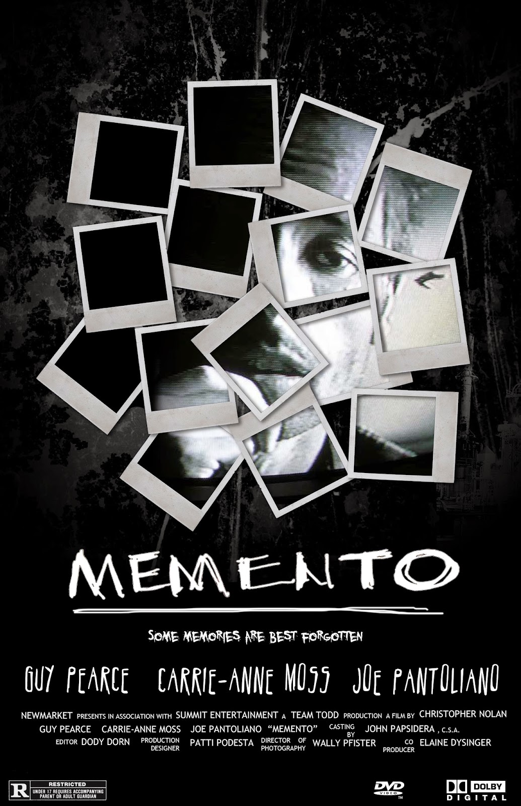
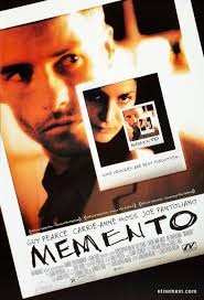
When we were looking into other psychological films to get inspiration and common conventions for our film poster we found the film memento which used Polaroid pictures in their film poster, the way that they used these was also very interesting to look at to see how they were placed and arranged on the film posters considering there were different styles of them.


The first poster consists of the two main characters looking into a mirror with three Polaroids displayed on the mirror as well. This has a big impact on the audience, it makes you look at the main characters as the woman is almost breaking the barrier between them and the audience but also gets you to wonder what are the Polaroids are trying to tell you as they are fairly small within the poster.
The typography of 'memento' is very bold as the white against the dark background draws your eyes to it even though it's not the main focus of the poster.
Also the way that the angle is positioned with the over shoulder shot involved makes you almost feel as if you are the main characters and know that the psychological element of the film is involving one of these characters.


The second poster's main focus is on the Polaroids themselves which are positioned right in the middle of the poster. The images in the Polaroids are almost like they are trying to put together a whole image but not quite doing so.
The colour scheme of black and white conform to the conventions of a psychological thriller film. The rough textured background makes you think there is something underlining within the plot and characters of the film.
The typography again on this poster is very bold against the black background and also the scratchy almost handwritten style of the text makes it look almost more personal and psychologically triggering as it looks as if one of the characters could have written this.


The third poster is very psychological as the Polaroid pictures are shown repeatedly over and over again creating a duplication of them on the poster. The same scrawly writing is used for the typography of the title which again give it a connotation to the psychological genre of the film. Again the colour scheme consists of dark colours but also within this poster there are some yellows, reds and oranges within the Polaroids. This gives them almost a street light glow to them, making them look more realistic and almost stalker like.  Placing the information on the Polaroid itself really draws attention to the importance of them as they also take up the whole of the poster.

Monday, 19 January 2015

Film Poster Deconstruction - Psychological Thriller:

As we are preparing to create our film poster to accompany our trailer, we were asked to look at film posters from our particular genre for inspiration and ideas that could influence our poster.

Zodiac (2007)

The first thing you notice when looking at the poster is the title which falls into the bottom of the 'Golden Rule' triangle. The typography itself is a bright white font which stands out amongst the mist coming from the bridge. There is also a symbol in the O, which ties in with the title and presumably has a link to the plot of the film.
The choice of image is a birds eye view, from high up on the San Francisco bridge, but only parts of the bridge are visible due to the fog that is covering most of the picture. The angle of the picture makes the person feel like they are staring down into the darkness which can be quite disorientating. 
The colour scheme is reflective of the genre which is a psychological thriller, the use of mostly darker colours, such as blacks and greys shows the potential darkness of the film. The picture also fades to a black outline around the edge which is quite a common convention of psychological thriller film posters.
Tagline = "There's more than one way to lose your life to a killer".  - gives a massive hint to the narrative/plot of the film and also the genre.
     

Lucy (2014)

The main image which takes up the whole of the background is a close up shot of the antagonist, who is staring directly at the camera, breaking the fourth wall.
The title of the film 'LUCY' is situated within the golden triangle and is also the thing your eyes are drawn to first as the typography used is just a simple black font, yet it is capitalised and translucent so the picture behind can still be seen.
If you focus on her face you can also see there is faded writing all over it which is relevant to our film and the book aspect, which we might include on our poster to show his craziness.
The whole poster is in black and white apart from the release date which is red and squeezed into the bottom left corner and also her eyes which are a unnatural and inhuman colour - this could link to the tagline which hints at this female character using 100% of her brain.
The two main actors name's are positioned at the top of the screen and although it mentions Morgan Freeman, it is clear from the poster that the focus of the film will be on Scarlett Johansson. 


Shutter Island (2010)

The poster for Shutter Island contains a close up picture of Leonardo Di Caprio whilst holding a match as he plays the main character and the image is in black and white, it occupies the golden triangle rule.
There is also an image of a small creepy island underneath in the bottom half of the poster and this links in with the title of the film - Shutter Island. The symbolism of the storm weather e.g. heavy rain and choppy waters is a convention of horrors and thrillers as it makes the situation more creepy and scary.
The typography of the title, which is situated at the bottom above the credits,is a bright red (along with the month of the release date) which gives a hint that there will be aspects of horror included in the film along with the main psychological thriller genre.
Tagline = "Someone is missing" - is a hint to what the narrative will be but it is unclear which role Leonardo Di Caprio will play.