To make an effective trailer the sound has to match the action that is seen on scene and portray the tone of the film. This is especially important in trailers as it is the first glimpse an audience will see, so it has to work well enough that the audience want to see more.
I was inspired by the sound in another psychological film stoker. What I like about this was the chilling tone of voice at the beginning of the trial and the use of the monotonous sound of the metronome and that when it stopped the pace of the editing increased to build tension.
Another film I was inspired by was moments. I thought that the camera flashes and the steady build up of tension.
To create effective sound on our trailer I looked for a website which contained royalty free music that we could use and found a website called incompetech which had a large amount of baking tracks to use. I put in the characteristics that would work well for our teaser trailer and downloaded some appropriate tracks that we could possibly use.
I then layered the appropriate tracks over each other so that we could have the most effective sound. I had to cut them and use a number of different tracks over one another so that we could get our desired sound.
We still weren't happy with our sound so I decided to include some sounds of a camera flashing when the images of the polaroids came up.
We also included a voice over which explained the narrative of the film without relying on actors as this can sometimes make it look armature.
We also decided to include some booms in when the killer is being shown to build tension and to
convey to the audience that he is intimidating, this pared with the low angle shot will convey the protagonists fear.
At the end we wanted it to be quite chilling and
so we put a loud high pitch ringing noise which you get after a dramatic event such as a car crash so that the audience felt like they were being abducted.
Sound is a very important part of a film, especially for a trailer, it sets the tone of the film and genre is easily recognised from the sound used in film. Because our trailer is a psychological thriller we wanted that to be easily identifiable from our sound. For this we looked at trailers of films for a similar genre to gain inspiration and take element from all of them to create the most effective sounding film trailer. Sound is also important for us as we do not use any diegetic sounds and therefore had to mimic those which would be recorded by the camera.
The Machinist 2004
What I found effective about this film trailer was
The slow steady build of the non-diegetic sound
The mixture of voice-over and diegetic speech, which portrays the confusion of the protagonists mind
Side Effects 2013
What I found effective about this trailer was
The unnerving tone to the non-diegetic sound making audience aware that something wasn't right
The sudden change in pace to build tension and matching that with lots of short shots
The long drawn out sound at the end of the trailer which makes the audience feel almost uncomfortable.
What we need to do is create the drama and tension like in the film trailers above without making it sound over dramatic and therefore sounding too much like an action film other than a psychological thriller. Though inspiration can be taken from both of these trailers.
After completing our first draft for our trailer, it was pointed out to us that if we included a more wider variety of shots, it would be more "trailer-like" as most trailers generally include shots from throughout the film, especially as we are creating a teaser trailer. However as we are not filming the whole film, we had to set up specific shots that would only be shown on the screen for our a couple of seconds but would add diversity to the type of shots we included.
We decided to use the girls that we photographed for the Polaroids, this made sense as they would have a role in the film and so are already featured in the trailer anyway. As we were focusing on the girls themselves, this meant we didn't need to look for a specific location to use as a background so we filmed all of the shots in school, saving us time.
We also realised that an average mid shot of our killer sitting down in his living room, didn't add anything to the mise en scene of our trailer and stood out as a bit bland so we changed the shot completely and just did a close up of his knees as he sits down.
A collection of the shots we used in the final version of the trailer are below, including more close ups, a point of view and a shot where the camera was on the floor.
I decided to complete an evaluation of our final trailer, after all the changes we have made to see whether we have improved since Megan did an evaluation of our first draft here.
Above is our final trailer, I feel the amended trailer is significantly better than our original first draft (as expected).
Firstly, the music dipped in our first draft, so it built up far too early, stalled for a few shots and then restarted and this wasn't working. The sound in our final trailer is definitely more effective, as it builds up more gradually until it culminates at the final moment after the Polaroids flash up. However we did have a slight issue with the final sound used, as when editing the sound effect we wanted was a high pitched ringing noise but unfortunately, when uploaded to YouTube the sound is affected slightly and so the audience won't feel the full impact.
Another part which was successful is our time lapses, when planning the locations that we could film in, we weren't sure how they were going to turn out but thankfully we managed to capture the shadow going over the National Gallery in Trafalgar Square which is a shot I think our group should be particularly proud of. Additionally the other shots taken inject a hint of pace into the opening shots of our trailer, which are slower in order to set the scene.
Our credits were also a risk we decided to take, as the idea we had could have worked or gone completely wrong but luckily it went well and is quite effective as it fits with our genre. However in our first draft, we included far too many, considering we are creating a teaser trailer rather than a theatrical trailer and they take up a lot of time, so we decided to cut out any credits which weren't essential for our trailer.
While editing our trailer in the early stages, we quickly realised (after advice from teachers) was that we didn't have a good variety of shots included, particularly as this is a teaser trailer. All of the shots used were filmed at a few locations and a lot were extremely similar, this was unconventional of teaser trailers, so we decided to re shoot some scenes with the girls we used for the Polaroids (his previous murders) as they would be a part of the actual film. We filmed these clips for a couple of seconds and then used them to help build up towards the height of the trailer and provide a range of shot types.
Overall, I think our final teaser trailer is successful and we have managed to improve and progress the piece without losing the direction that our original ideas were pointing to.
This is our final film poster, we decided to compose the poster with the protagonists polaroid in the middle and in colour to bring attention to the audience and give them an understanding that she is an important part of the story. We also decided to not include a large amount of colour to convey the atmosphere of the narrative. We have a serial killer included in the narrative and therefore did not want to make the poster look to happy. We chose to use the same font as the film title in the trailer to portray professionalism. We have adhered to the conventions of a film poster by having the title in large font the, the tag line on the poster somewhere and also having reviews of the film. At the bottom of the poster we also have all of the names of the companies and people involved in the film, we decided to use a different font here because when we used the same font as the film title it was quite difficult to read. At the very bottom of the poster we also have the rating of the film and all of the companies that it is associated with. Paramount are the distributers of the film and Dolby digital which converts the footage to a format that can be used in cinemas and on DVD's. We feel that that the background image of a dirty wall reflects the tone of the film as a whole.
When adding our title onto our website because we had a specific typography that we have been using throughout our other pieces of coursework. As we could not download our chosen font onto Wix we had to input our title as an image.
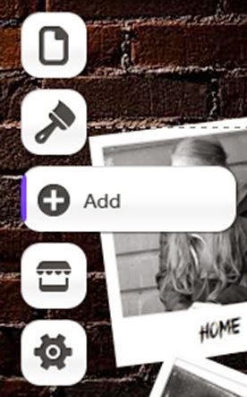
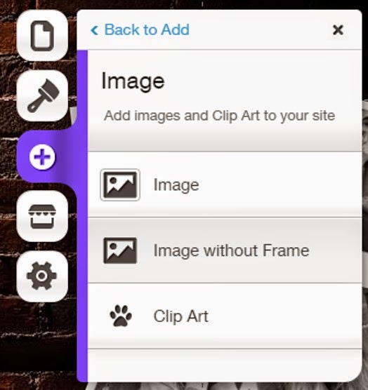
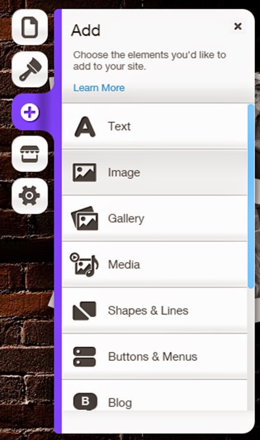
To do this we went onto the add button displayed at the side of the editor on Wix and chose to add an image without a border. If we had chosen to add an image with a border then it would not have the look that we want our website to have and might have mad it look less professional.
This then led us to an upload page in which we searched for the image of our title that we needed, that we had already created prior on PowerPoint, and uploaded it to the website.
Once we had done this the image then appeared on our website. We had to re-size and move the image into place on our website. We also made sure it was centered by using the grids that were already placed on the editor to help with this. We placed the image at the top of the page in the center.
We decided to create our website on wix.com, we opened up a blank website format so that we could have complete freedom to where we could place items on our homepage.
Firstly we decided on a background, a brick wall image like the one in our poster. We saved this to our computer system and then proceeded to add the background to our website layout.
To do this we went onto the design button on the website which led us to the background and general design of our website.
We selected the background button of the design tab which allowed us to customise our background with images that have been defaulted onto the website creator. Although, because we had already saved an image that we wanted to use as our background we selected the customise button which allowed us to upload our own image to use as our website's background.