Tuesday, 21 October 2014

Our Film trailer


We were tasked to put a pitch together which explained our idea for the narrative of our film, we also had to create a mood board which represented our film, find a website and film trailer which we found inspiring from our chosen genre. This is our mood board, we chose images of homlesnes and london as are basis.
Our idea for the narrative of our film is to have a serial killer who is obsessed with homless girls and thinks that they are the scum of the earth and kills them. The killer has been working for quite a while and every year he kills a girl but this year there is a problem. We were inspired by American psycho and the obsessive behaviour that he has and we want to replicate that same neatness in our trailer. Originally we wanted to mesh two genres together: Urban drama and Psychological thriller but we decided that this would not work as well and so have decided to have an urban setting but not any of the conventions.


The side effects trailer inspired us as it is a psychological thriller which has some urban settings, though this is not a focal point in the film. The cinematography is also very effective and we will will try to replicate the beauty of the shots.
We were inspired by this film website as the way it is put togehter is very clean. The titles of each charachter have a gif of them in some part of the film keeps the audiecnce intrested in the specific  charachters. There are also links to social media which allow people to share it, indreasing audience participation. The colour scheme that is in the film  poster also runs through the images shown on the website which shows cohesivness and gives a vey profesional look. There is also links to buy tickets and watch the trailer, everything is on
one page, and it is easy to navigate. There also even adverts of Ablixa, which is a very important plot point in the film, which makes the website very emursive and also makes the drug seem quite real.

Saturday, 18 October 2014

Lighting Research.

Lighting can contribute to narratives in many ways, such as creating atmosphere or contributing to characterisation.
Different terminology for types of lighting.
Key light. The main source of light in a scene.
Fill light. The secondary source of light in a scene, often used to reduce shadows.
High key lighting. A scene that is well lit with few shadows.
Low key lighting. A scene with little light resulting in shadows and darkness, often used in horror and film noir.
Backlight. A light positioned behind the subject, often casting them into darkness.
Rim light. A light positioned above and slightly behind the subject which helps to define the edge of the figure. Sometimes referred to as a hair light.
Hard light. A lighting source that casts harsh shadows.
Soft light. A diffuse, ambient light.
ChiaroscuroAny shot that uses low key lighting, high contrast and shadows.
Three point lighting. The common use of a key, fill and backlight.


This video intrigued me as it lists lots of different types of lights that can be used to have different effects on the lighting of the scene and shot. It ranges from very soft lighting giving the frames a friendly, comforting feel to it to lower key lighting and lots of angular lighting giving the frames more of a dramatic atmosphere to the scene.

They also showed how to use different types of gels to create different coloured scenes and atmospheres. It also was interesting to see how these gels could be used to look like flashing lights out side from different environments e.g. from a hotel or club sign.

It contained useful tips that would be able to be recreated by most people, even with different equipment.

Wednesday, 15 October 2014

Final Polaroid pictures :

the Pologram app


After taking the shots for our Polaroid pictures I used an app called Pologram which prints photos from your phone off in a Polaroid style and sends them to you. We chose our final nine - 8 from the photoshoot and 1 of Emily from the day in London. Each Polaroid costs only 29p to print and with a code I got nearly 50% off including delivery.


Our plan for these Polaroids is to have them in a book, in which our serial killer will plan his murders and have pictures and souvenirs like newspaper clippings to show his obsessive side. We decided that our killer would kill once a year for 8 years, with the month changing so there would always be a year and 1 month (maybe for planning) between each killing which would always take place on the 1st.

Here below are our final Polaroids which are ready to be filmed inside the book.


Hayley - 2007
Catherine S - 2008


Emily B - 2009
Gemma - 2010


Pooja - 2011
Catherine G - 2012


Kate - 2013
Polly - 2014


Emily F - 2015 (our main girl)


Dreamlike editing

Many psychological thrillers have a quite dream-like feel to them, this is often portrayed through the editing and the choice of music, this is easily seen in the trailers of these films.

Stoker


The dreamlike qualities are shown throughout the trailer but they start in the opening scene with there being a blur around the edge of the shots and the use of soft colours which conveys the idea of nostalgia. The voice over at the beginning is also quite chilling as Nicole Kidmans' voice is very soft and it therefore sounds like she is close to the audience. This is quickly contrasted with the harsh words that she says to her daughter which contradicts the earlier idea of nostalgia. The sudden change of pace creates a quite aggressive tone and conveys the psychological element of the film and it could also be seen as to be quite nightmare-ish. The monotonous tone of the metronome conveys the idea of a differentiation between the surreal and reality. The continuos movement of the camera also creates a dream like atmosphere this is also enhanced by the slow motion shot in the shower which is quite surreal. The choice of colour also is quite dream like as it is very soft and there are not any bright colours. The continuous use of extreme close ups is quite surreal and disorientating.

Side effects


Like stoker the choice of colours in Side Effects are very light and neutral which creates a very calm tone. Some of the shots also utilise the depth of field by focusing on the characters whilst leaving the background behind them quite blurry which is quite dream like. The cross fades between each shot also give the trailer a very fluid and surreal tone added to by the non-diegetic piano music. The blurryness and the sudden change in pace in the trailer portray a disorientation from reality. The fast pase of the edits also build tension as the the non-diegetic sound is building, which is quite effective.The constant close up shots also create a distorted view of the narrative of the film. The tone of the trailer changes quite quickly from dreamlike to quite frantic through the building of the non-diegetic singing and the pace of the shots, this is quite effective as it hooks the audience into the narrative.

Tuesday, 14 October 2014

Under the skin


What did you find interesting about the  extract?
In the "Under the skin" trailer there is a repetition of red throughout which could represent the promiscuous nature of the protagonist as she is shown to be quite seductive and therefore powerful as the men she meets seem to be entranced by her. It could also represent the danger which she brings on herself throughout meeting these people. The audience might be wary of her motives for her actions and therefore not trust her. This also makes her quite interesting to the audience as there is a large element of intrigue.

The non- diegetic sound at the beginning of the trailer is almost painfully high pitched which makes the audience quite uncomfortable and it links to the the science fiction genre as it sounds quite futuristic. The introduction of the voice over by Scarlett Johanson also links to the science fiction genre as the sounds she are making suggest to the audience that she is not quite human. The mise-en scene however does not conform to any specific genre an it confuses the audience of the specific genre as it is not futuristic enough to be considered science fiction. The neutral   tone of all the clothes apart from her lipstick mirrors the naturalistic establishing shots of the countryside.

The locations that are use are polar opposes from each other; there is a urban city and a desolate beach. The naturalistic locations have high key lighting and it is almost too bright to look at. This could represent the harsh beauty of the natural world around the protagonist and it could be their view of seeing it the first time. The scenes in the city location are much darker and less colourful which could suggest that there is no beauty in the city. There is also a lot of contrast in the colours that the protagonist is wearing, mainly blacks and dark browns and the stunningly bright background. This portrays to the audience that there is something dark going on in the characters life.

The cross fade between the different shots of the locations give the extract a surrealist fell a there is not much distinction between the different scenes. The fast paced building of the stringed instruments conveys the idea that there is chaos in the scene and the constant slow paced drum bet does exactly the opposite. The non-diegetic sound is quite confusing and adds to the surrealism of the trailer.

The use of extreme close ups and the eye is quite disorentating for the audience as it does not seem to have any relevance to the narrative other than adding to the surrealism, and the close ups of her knees are also quite suggestive. The non-diegetic sound of the ticking clock and the fast beat of the drum also builds tension and atmosphere which is quite effective.


Sunday, 12 October 2014

Trailer Deconstructions:

We were asked to research and deconstruct two trailers of our chosen genre, in our case psychological thriller, one has to conform and one has to subvert the genre conventions only looking at sound and editing.

The Machinist: (2004)


  • low ominous non diegetic music in the background, builds up with drums and regular beats
  • music suddenly becomes more dramatic as the speed of editing increases, sounds more classical instruments
  • diegetic work noises, saw, possible knife slashes?
  • dark neutral colours interrupted by flashes of bright light
  • edited so it looks slightly faded, weird effect adds to psychological impact
  • no bright colours at all - shows the darkness and intensity of the film
  • high pitched whirring noise contrasts with the low rumbling
  • tagline, main actors name and film title are main credits included in trailer, simplistic white font on black background


LOCKE: (2014)


I chose this trailer as it challenges conventions by only having one location/setting for the whole trailer which lasts 1.30 minutes.

  • whole trailer shows main character driving a car
  • one shot at beginning of an urban city area - shows location
  • has to rely on sound and editing to excite/intrigue the viewer as no change in character or location
  • editing is mainly different shots and clips of the main character speaking and driving
  • interrupted with reviews of the film, bright lighting on a black background contrasts against the rest of the trailer
  • set at night so lighting is very low-key and mostly dark colours are used
  • sound is mostly voice-overs and conversations where he is on the phone 
  • non diegetic music is continuous throughout the trailer low ominous rumbling noise which builds up slightly to the end
  • slow pace of shots, longer between change of angles

Evaluation of Photoshoot for Polaroids:


As part of our trailer, we wanted to include evidence of the previous murders our serial killer has committed and we decided to do this in Polaroid form. Instead of using an actual Polaroid camera, there's a website where you can submit pictures taken with a phone or camera and they will be printed in Polaroid form and sent back to you.

As we decided our killer will have murdered 8 girls in the past 8 years, we asked 7 of our friends (and me) if we could take a photo of them looking like a homeless teenager. We were able to take them in school as the pictures would be close-ups of their face and only a small amount of the background would be shown, enough to show the location.


Catherine G: (left)


For this shot we liked the effect of the wooden door with all the paint peeling away and also the scaffolding at the side.
Catherine is wearing a blue jumper and black trousers and we asked her to sit up against the scaffolding in the corner as if she is trying to keep warm.
When Megan was taking the shot, we tried to include the scaffolding in the framing and I think in the final one we've chosen it works quite well as it adds the stalker element to it.


Emily: (right)

We got Emily to sit next to a "Corrosive" sign and I liked the symbolism represented through the idea of danger. She is wearing a brown hoodie and dark trousers although you won't be able to see them properly in the actual shot. Emily is covering her face, which shows her bruises and to hint that she is scared and also gives an idea that she wants to remain anonymous to the public and is ashamed to show her face.

Gemma: (left)

For this shot, we made Gemma crouch down by a drainpipe which reinforces the phrase 'living in the gutter'. She's wearing a grey baggy jumper, has messy hair and also a bruise on her face to show she's been in some sort of a fight.

We also asked her to look behind her as if something or someone has scared her and I think this is quite effective.
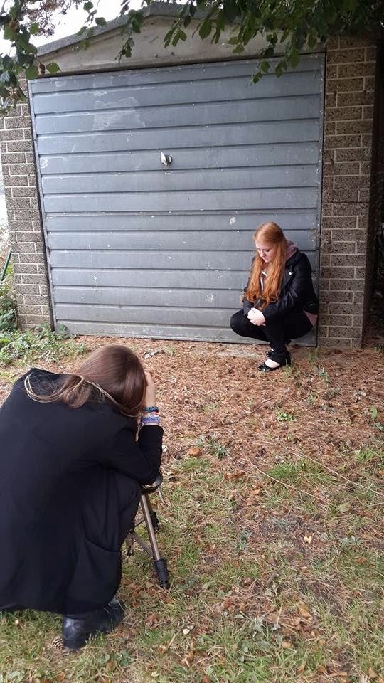


Hayley: (right)

For my shot, Alice made my face look really dirty and messed my hair slightly. I wore a hoodie with a jacket over the top so I was layering my clothes. We thought it would be a good idea to use the garage door as the background to show the urban setting of film. I also looked into the distance, similar to Gemma's shot above.


Polly: (below)

We selected a wooden door by an old shed on our school grounds as our background for this shot. Polly is wearing a blue faded hoodie and again is crouched on the floor to make her more inferior. Similar to Emily, she is covering her face so we can see her injured knuckles, but looks more like she could be crying and upset rather than just ashamed of her position.
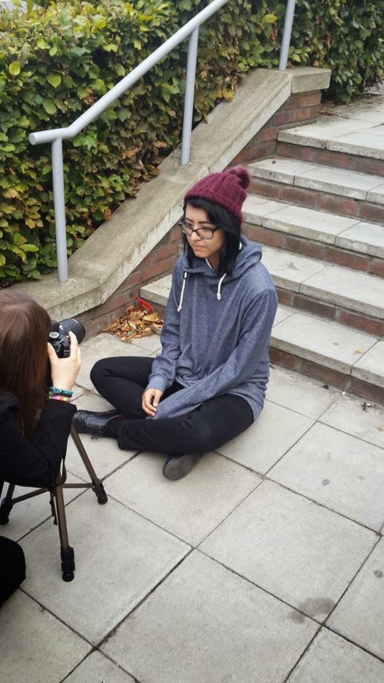

Catherine S: (left)

Catherine is wearing a burgundy beanie and a grey hoodie with black trousers, In the actual shot we decided to have her not wearing glasses as I don't think a young homeless teenager would be able to afford them or they might have been stolen/broken. She is sitting by some stairs and again in the shot we can see cars in the background, hinting she is at a car park. We also asked her to have her hand over her mouth slightly, almost in shock which shows how upset she is to be homeless and vulnerable.
Pooja: (right)

In our school park, there is a rubbish area and we noticed the wooden panelling and the shopping trolley and thought it would be a good area for one of our homeless girls to sit. Pooja is wearing a grey hoodie and we asked her to look really desolate and innocent and lean up against the panel.

Megan also did a post about our final shots which you can see here.