In what ways does your media product use, develop or challenge forms and conventions of real media products?
Teaser Trailer.
 |
| (mid shot of our victim) |
 |
| (POV shot of our killer) |
In order to follow the conventions of a typical teaser trailer, we completed deconstructions on existing trailers that we thought were successful in their job to intrigue and excite the audience. I also completed a deconstruction of the trailer and some research from watching the film 'Nightcrawler' as I felt it had several connections to our own film package.

 We followed the structure of most teaser trailers well, including the important features such as a green screen, production company and numerous credits as well as the title of the film being placed at the end. The trailer starts off with the 'green rating screen' and we decided to rate ours as a 'restricted' film (as our production company are American), although in the UK it could be considered a 15. This is because even with it being a psychological thriller, it would still contain horror elements such as details of the murders and hopefully the audience would be frightened by the idea that a serial killer can look so ordinary and live so near by (our intention was to portray him that way). We then included a clip of the Paramount Pictures opening credit but shortened it from 20 to a few seconds to fit in with the pace of a teaser trailer and also put an effect over the top in Final Cut Pro so it wasn't too bright for a psychological thriller.
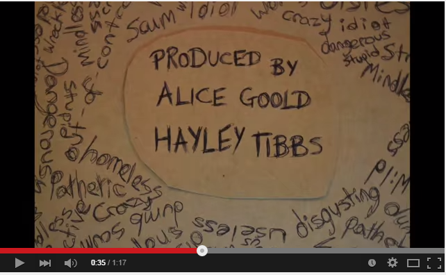
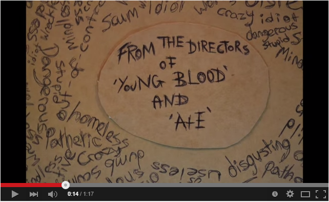 For our credits, we developed the idea of stop-motion effect writing to resemble the killer writing in his book and so Megan took individual pictures while writing out the credits and we edited them together on Final Cut. This developed the conventions of the credits typically used in psychological thrillers. However teaser trailers don't usually contain that many credits as they can take up too much of an already restricted time limit so I feel we challenged that convention slightly, by having a longer trailer and therefore more space to include credits.
  The first credit was "From the directors of 'Young Blood' and 'A+E'" and these types of credits are often used to highlight what previous films it will be similar to and therefore the audience can make a quick judgement as to whether they think they would enjoy it or not. Similarly we then used "Produced by Alice Goold, Hayley Tibbs" and "Directed by Megan Tee" for the same reason and to highlight who created the film.
We then used our tagline "One Predator, His Prey, Their Punishment" as this often highlights the plot of the film and it is important to include it in a teaser trailer and because this was a longer credit we placed it right before the pace of the shots began to speed up towards the climax of the trailer before our final credit which was the title of the film.
In terms of sound, teaser trailers often use voice-overs from the film to play over the quick paced shots as there isn't enough time to show huge sections of dialogue. In our trailer, the beginning is a low humming noise and we placed a voice over on the top in the format of a news report to highlight the context of the film... "so far there has been a total of 8 deaths in the past 8 years". The music in teaser trailers will usually build up to the climax at the end and we followed this convention in ours. We used various background tracks and edited particular sections to help it build up. This was aided by the use of a 'cinematic boom' sound effect which was paired with the quick-paced flashback shots, a whirring metallic sound every time a credit was shown and also a high pitched eerie noise at the end.

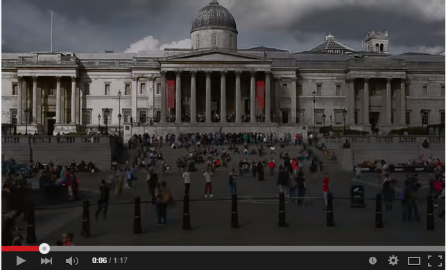 The editing through our trailer followed the conventions of a typical thriller trailer, it started off with slower paced shots (such as the time lapses and shots of London) and then built up speed with shorter shots being used to increase tension (such as the flashback shots right at the end). These flashbacks shots were filmed using a wide variety of camera angles and in order to resemble this trait, we had to organise another filming date with our previous victims as the footage already in the trailer wasn't intriguing and exciting enough.
We challenged the conventions of locations in psychological thrillers, as by setting it in London and therefore using well known tourist attractions, the locations we chose resembled those used in urban drama films. However, as the majority of our trailer is showing our victims original equilibrium (Todorov's Narrative Theory of Equilibrium) and how our villain is going to disrupt that, most of the filming locations are going to be in urban areas.
Poster.
The conventions of a film poster are
We have conformed to most of these conventions, we include the main character and she is seen to be different as her Polaroid is larger than the others and the fact that she is in colour and the other girls are in black and white.
Also the genre is quite clear as we have used predominately dark colours especially towards the edges which eludes to the darkness in the narrative. The hands around the face of the protagonist also reveals the narrative to the audience this is also reinforced with the title and tag line. The polaroids of the girls are also quite an important aspect of the narrative. We also researched this and looked at the possible ways in which we could use the polaroids. We were inspired by Momento which is another psychological thriller which uses polaroids in its posters.
We found that for our website we must ensure that it is:
Planning.
For our website we started off by drawing up some initial ideas to what our website could look like. With this we also ensured that we had all of the conventions and elements of a website included in our own and also our deconstructions of previous films (Akeldama, Final Destination, Dead Footage) we were able to see what elements were effective on a website and other that did not work so well.
Development.
We developed our website by using a background that is appropriate for our genre and ties into our narrative. We have included the Polaroid pictures which can be seen a constant throughout our trailer which involves our protagonist's past victims. However, our protagonist's potentially next victim is not displayed on our website this was intention to allow for our teaser trailer's conventions of having a restricted narrative so that our narrative could be enigmatic and entice our audience further. We also included our teaser trailer embedded into our website which is another convention of a website for a theatrical film and also to allow the teaser trailer to play automatically when the website loaded.
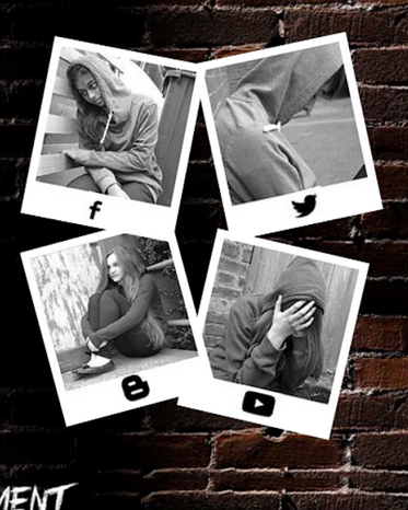
We also had to include social media links which were active onto our website's design. The defualt for these links (Facebook, Twitter, Youtube, Blogger) were very different to the atmosphere of the rest of the website and also to our trailer. Instead of adding these default links to our website we decided to put them onto the bottom of the Polaroid pictures and created these as 'photo buttons' so that they could lead to a link. This allowed for our website to be user friendly as the links are clearly displayed to our audience and it also stays within our colour scheme and genre conventions.
Our buttons which connected to our other pages and social networking links allowed us to develop on the typical conventions of websites, as these are essential to the website's design. We have manipulated them to allow for our constant use of the Polaroid pictures to still continue and so that it keep in line with our other products and genre.
In terms of sound, teaser trailers often use voice-overs from the film to play over the quick paced shots as there isn't enough time to show huge sections of dialogue. In our trailer, the beginning is a low humming noise and we placed a voice over on the top in the format of a news report to highlight the context of the film... "so far there has been a total of 8 deaths in the past 8 years". The music in teaser trailers will usually build up to the climax at the end and we followed this convention in ours. We used various background tracks and edited particular sections to help it build up. This was aided by the use of a 'cinematic boom' sound effect which was paired with the quick-paced flashback shots, a whirring metallic sound every time a credit was shown and also a high pitched eerie noise at the end.

 The editing through our trailer followed the conventions of a typical thriller trailer, it started off with slower paced shots (such as the time lapses and shots of London) and then built up speed with shorter shots being used to increase tension (such as the flashback shots right at the end). These flashbacks shots were filmed using a wide variety of camera angles and in order to resemble this trait, we had to organise another filming date with our previous victims as the footage already in the trailer wasn't intriguing and exciting enough.
We challenged the conventions of locations in psychological thrillers, as by setting it in London and therefore using well known tourist attractions, the locations we chose resembled those used in urban drama films. However, as the majority of our trailer is showing our victims original equilibrium (Todorov's Narrative Theory of Equilibrium) and how our villain is going to disrupt that, most of the filming locations are going to be in urban areas.
Poster.
The conventions of a film poster are
- Making the genre easily identified
- A small glimpse of the narrative
- Including the main characters of the film
- A date or time of the films release
- Information of the production company and directors at the bottom
- Reviews of the films from respected publications.
- The title of the film clearly shown
- A tag line linking to the question
We have conformed to most of these conventions, we include the main character and she is seen to be different as her Polaroid is larger than the others and the fact that she is in colour and the other girls are in black and white.
We also looked at the conventions of psychological thriller posters and did some deconstructions we found that they often included a large face in that is prominent in the poster. For example this is seen in Lucy, shutter island and Black Swan.
Also the genre is quite clear as we have used predominately dark colours especially towards the edges which eludes to the darkness in the narrative. The hands around the face of the protagonist also reveals the narrative to the audience this is also reinforced with the title and tag line. The polaroids of the girls are also quite an important aspect of the narrative. We also researched this and looked at the possible ways in which we could use the polaroids. We were inspired by Momento which is another psychological thriller which uses polaroids in its posters.
Although we do subvert the convention of including the psychologically disturbed individual, we did this as we wanted to keep the hunter quite mysterious and focus on the vulnerability of the protagonist. We also subvert the golden rule which has the area that your eye is immediately drawn to at the top of the triangle.
We also conform to showing the important information such as the production company and all the people involved in the film such as the casting director and actors. We also included a hashtag which is also linked to our website.
Website
When we first thought about creating our website we looked into other professional film websites to see what some of the typical conventions and features that were included that we could therefore include in our own. We also looked at previous A2 websites to see what layouts worked best and what generally was good and bad about them.We found that for our website we must ensure that it is:
- suitable for our target audience
- had our teaser trailer embedded and starts playing automatically
- clear title of the film
- suitable colour scheme and text colours
- social network links
- user friendly, not complicated
- critics reviews
- production companies
- age rating

Planning.
For our website we started off by drawing up some initial ideas to what our website could look like. With this we also ensured that we had all of the conventions and elements of a website included in our own and also our deconstructions of previous films (Akeldama, Final Destination, Dead Footage) we were able to see what elements were effective on a website and other that did not work so well.
Development.
We developed our website by using a background that is appropriate for our genre and ties into our narrative. We have included the Polaroid pictures which can be seen a constant throughout our trailer which involves our protagonist's past victims. However, our protagonist's potentially next victim is not displayed on our website this was intention to allow for our teaser trailer's conventions of having a restricted narrative so that our narrative could be enigmatic and entice our audience further. We also included our teaser trailer embedded into our website which is another convention of a website for a theatrical film and also to allow the teaser trailer to play automatically when the website loaded.
We also had to include social media links which were active onto our website's design. The defualt for these links (Facebook, Twitter, Youtube, Blogger) were very different to the atmosphere of the rest of the website and also to our trailer. Instead of adding these default links to our website we decided to put them onto the bottom of the Polaroid pictures and created these as 'photo buttons' so that they could lead to a link. This allowed for our website to be user friendly as the links are clearly displayed to our audience and it also stays within our colour scheme and genre conventions.
Our buttons which connected to our other pages and social networking links allowed us to develop on the typical conventions of websites, as these are essential to the website's design. We have manipulated them to allow for our constant use of the Polaroid pictures to still continue and so that it keep in line with our other products and genre.


.jpg)


